Welcome
- To deploy the app on command line or to create a URL using Heroku, access our GitHub repository here
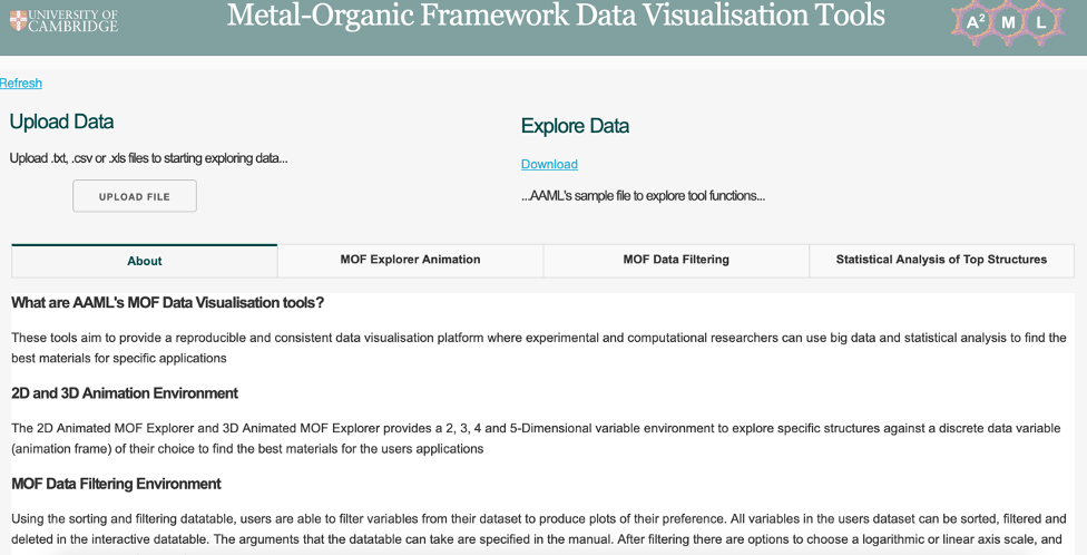
About
These tools aim to provide a reproducible and consistent data visualisation platform where experimental and computational researchers can use big data and statistical analysis to explore their data or the adsorption related data we provide to find the best materials for specific applications. Improving from the original Metal-organic Framework (MOF) Explorer, this tool now allows individuals to upload their data set to analyse data in a 2D and 3D environment in an animation frame, filter data through the interactive data table and also perform statistical analysis on top performing structures.
Data File Requirements
The data file to upload must meet the following requirements:
1. A .xlsx, .csv or a .txt data file must be uploaded. Please note that large .xlsx files take time to process so .csv or .txt files are preferred. For .txt files the application only accepts comma text separators.
2. The uploaded datasheet must have the structure name or identifier on its first column (shown in table 1).
3. The uploaded datasheet must be completely populated (no blank cells). Blank cells can be replaced to ‘0’ using the ‘Replace All’ function in Excel
4. If required, data must be transposed so that there is a single column stating the variables simulated with a column for the desired animation frame containing discrete numerical values (e.g. pressures). Example data files before e.g. AAML_Oxygen_Raw_Data.csv and after transposition AAML_Oxygen_Data.csv can be found here
5. For the MOF Explorer Animation, a discrete numerical data variable column must be present in your data set. This is a column that contains integer type values (no floats). A suitable column, for example, would be a column containing different pressures used to run simulations/experiments of 1, 5, 10, 20 and 50 bar. Include this column even if your data does not have multiple pressures and state the pressure your simulation has run on as you must have at least one animation frame column type to run the MOF Explorer Animation tab.
6. If you have the Structure Groupings (MOF families for example) in your dataset, the column must have the heading ‘Family’ (shown in table 1).
Example files showing datasets before and after being transposed can be seen in the GitHub repository. Excels formatting capabilities, Bash and Python were and can be used to transpose and fit the aforementioned files to the above criteria.
Table 1: Example File Upload
| DDEC code | Family | Pressure | Grav. Uptake (mol/kg) | Vol. Uptake (cm3/cm3) | Qst (kJ/mol) | … |
|---|---|---|---|---|---|---|
| AFIXAO | ZIF | 1 | 0.3379 | 8.4985 | 15.6505 | … |
| ABUWOJ | ZnO | 1 | 0.5687 | 14.7654 | 16.5644 | … |
| AVAQIX | None | 1 | 0.8956 | 26.2387 | 18.2041 | … |
| HOWPUF | None | 1 | 0.3486 | 7.5929 | 19.7446 | … |
| HOWQAM | None | 5 | 0.5020 | 11.4214 | 15.7436 | … |
| HOWQEQ | None | 5 | 0 | 17.5332 | 16.8026 | … |
| HOXKUB | None | 5 | 0.4167 | 16.0261 | 20.7236 | … |
| … | … | … | … | … | … | … |
The tab of the app will fade when the app is computing a user input. It will return to its original color once it has completed the user's input (Figure 2). In addition to the faded tab, the dashboard browser tab will show “Updating…” when the tool is updating the data. Wait for this to return to ‘Dash’ before using the tool. This is when the file upload is complete.
Functions found on 2D Plots
Download plots
As shown in the picture, click on the camera icon and get the plot in PNG format.
![]()
Pan mode
If the plot’s drag mode is set to ‘Pan’, click and drag on the plot to pan and double-click to reset the pan.
![]()
Zoom modes
If the plot’s mode is set to ‘Zoom’, click and drag on the plot to zoom-in and double click to zoom-out completely. i.e. auto scale of both axis. The user can also zoom in and out by clicking on the + and – buttons. Axes labels will automatically optimize as you zoom in.
![]()
Reset axes
One can also drag the x and y axis in a horizontal and vertical motion respectively to move along the length of the axis. When the user drags the middle of the axis, a double headed arrow will appear. This allows the user to adjust the range of the axis i.e. both the lower and upper bound (Figure 6). Clicking ‘Reset axes’ will reset the axes.
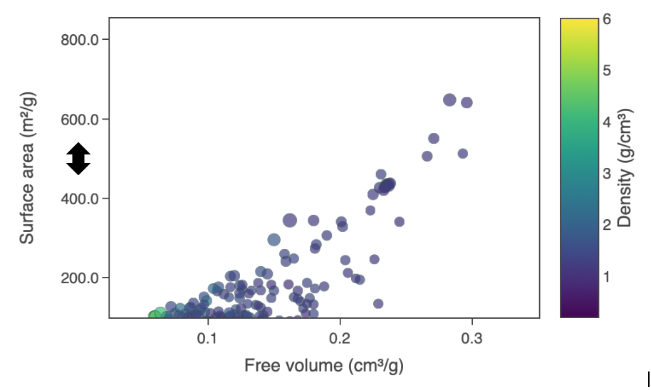
Figure 6: Reset axis double headed arrow
When the user drags the top of the axis or the bottom of the axis, a single headed arrow will appear. This allows the user to adjust only the upper limit of the axis i.e. the upper bound or the lower limit of the axis i.e. the lower bound respectively. (Figure 7). Clicking 'Reset axes' will reset the axes.
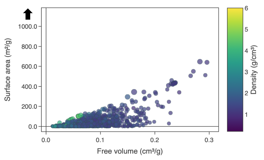
Figure 7: Reset axis single headed arrow
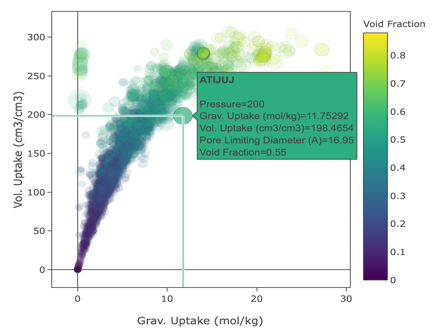
Hover options
One of these two buttons is selected at all times. Clicking ‘Show closest data on hover’ will display the data for just one point under the cursor. Clicking ‘Compare data on hover’ will show you the data for all points with the same x-value.

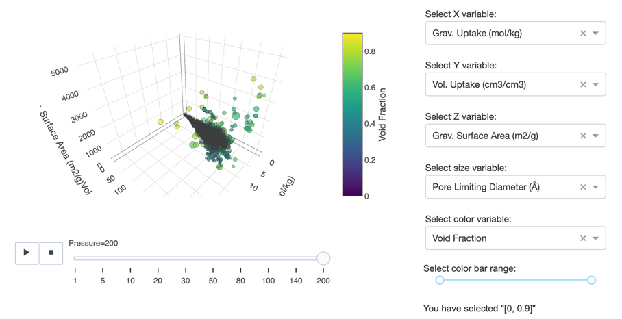
Functions found on 3D Plots
As well as the icons found in 2D plots, 3D plots also have the following icons to assist with data exploration. The mode bar for 3D charts gives you additional options for controlling rotations and also lets you toggle between the default view and your last saved view.
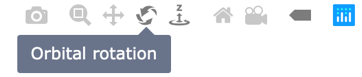
Orbital rotation
Orbital Rotation rotates the plot around its middle point in 3-Dimensional space.
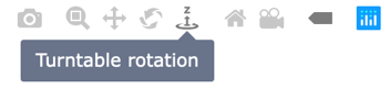
Turntable rotation
Turntable Rotation rotates the plot around its middle point while constraining the z-axis slightly.
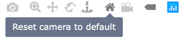
Reset camera position to default
Clicking Reset Camera to Default zooms back to the default position at 45 degrees from all axes.
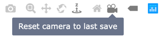
Reset camera position to last save
Clicking Reset Camera to Last Save returns the plot to the last saved position as set in the Organise view.
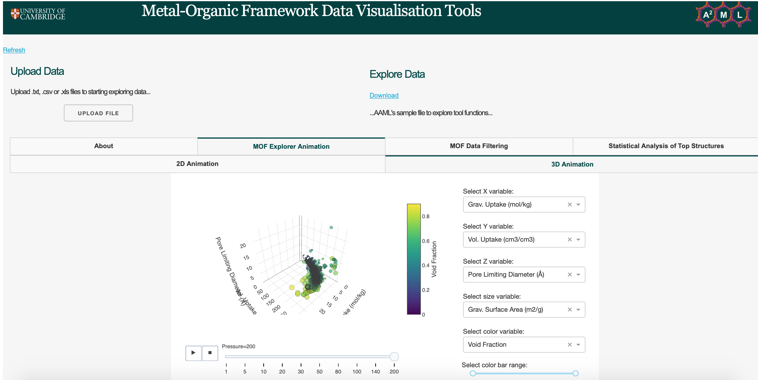
MOF Explorer Animation
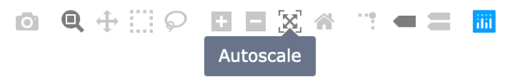
Auto scaling animations
With all animations, auto range in frames is currently not supported in Plotly. Therefore, the user must slide the maximum animation frame and press the auto-scale button on the toolbar at the top right side of the plot. The user can then press play and the range will auto-scale automatically.
2D Animation Environment
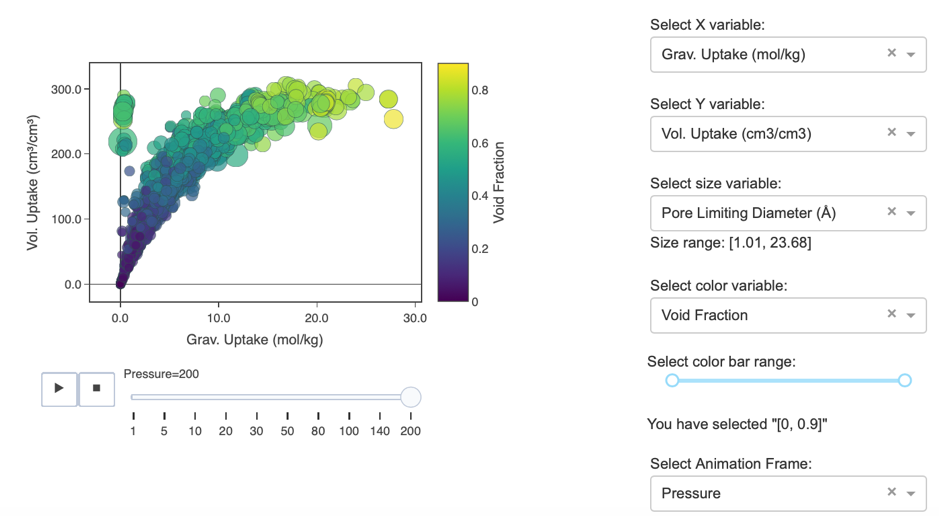
Zoom in animation tools
Double-clicking on one structure will result in the plot focussing on a said single structure. Running the animation will allow you to see the focussed structure during the animation frame. To return the standard plot double click the plot.
3D Animation Environment
The 3D Animation Environment provides a 5-Dimensional variable environment to explore specific structures against an animation frame of choice to find the best materials for the user's applications. Populate ALL the dropdowns to produce your plot. The tab of the dashboard will be ‘Updating…’ and then return to ‘Dash’ once your command has been fully executed. Clicking Play and pause will play and pause your animation respectively. You can also use the slider to pause the animation at a specific frame.
MOF Data Filtering
Using the sorting and filtering data table, users can filter variables from their dataset to produce plots of their preference. All variables in the user's dataset can be sorted, filtered and deleted in the interactive data table. The user can select and delete certain columns according to their preference. The arguments that the data table can take are specified below. After filtering there are options to choose a logarithmic or linear axis scale, and choose a color scale of choice from the Viridis color palette.
Interactive data table
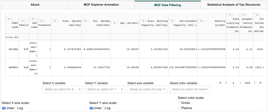
Populate ALL dropdowns and radio items to produce your plot. The tab of the dashboard will be ‘Updating…’ and then return to ‘Dash’ once your command has been fully executed. The heading tab will also fade in color and return to its original color once the app has computed user inputs.
Filtering plots using the data table
The syntax for the data table can be seen in table 2. These criteria will filter both the data table that is present but also filter the data on your plot. For example, figure 16 shows the reproduced plot when the ‘Pressure’ column has the argument ‘>50’ and the ‘Family’ column has the argument ‘ZIF’. X and Y axis is linear and the ‘Plasma’ color scale is chosen.
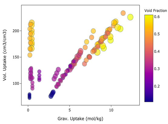
Figure 16: Data table plot example
Table 2: Syntax for interactive data table
| Syntax | Description |
|---|---|
| > or gt (int) | Values greater than the integer specified |
| < or lt (int) | Values less than the integer specified |
| = or eq (str or int) | Values equal to the string or integer specified in column x |
| >= (int) or ge | Values greater than or equal to the integer specified |
| <= (int) or le | Values less than or equal to the integer specified |
| != or ne (int) | Values not equal to the integer specified |
| B (str) | Values containing ‘B’ |
| = “core-mof-ddec-1” (str) | Values equal to the string specified1 |
| contains (str) | Values equal to the text value specified |
| datestartswith ‘yyyy-mm-dd 00:00’ (dates and times only) | Will match dates specified in the search. Can specify a particular, year, month, day or time. |
1 If you have spaces or special characters (including -), these must be wrapped in quotes. Single quotes, double quotes, or backticks work. If you have quotes in the string, you can use a different quote, or escape the quote character. E.g. ‘Hello “There”! ’and “ Hello \ ”There! \ ” ”
Statistical Analysis of Top Structures
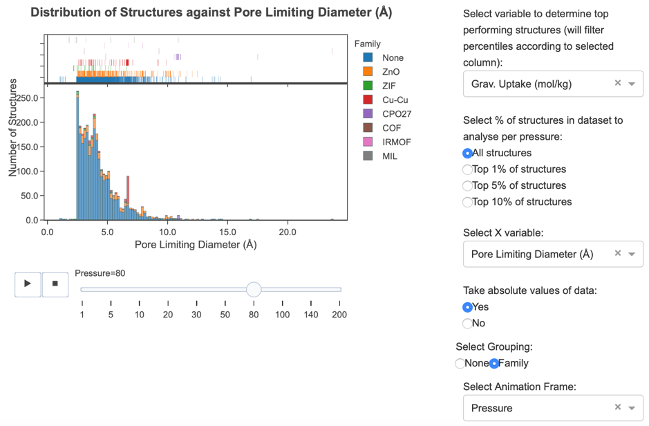
All structures or top-performing structures (1%, 5% or 10% of all structures) can be analysed in accordance with a set variable decided by the user e.g. Deliverable Capacity. In the violin plot, geometric properties can then be analysed against a discrete variable of choice to determine Q1, Q3, IQR, mean, median, maximum and minimum points for a dataset of the users choice, alongside the distribution of MOFs in said violin plot. In the distribution plot, the number of structures against a variable in the user's data frame can be analysed to determine the spread of structures in the user's data. The user can also decide if they would like the absolute data or original data to be analysed. The distribution can be further filtered by MOF families (if the user has uploaded this information in its data frame). An animation feature is also available to view these frames in accordance with a discrete variable of choice.
Violin Plot
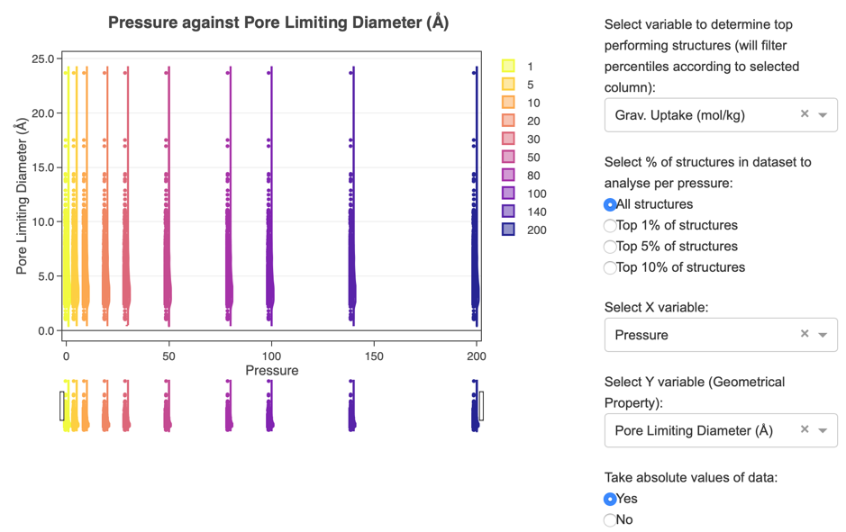
Using the legend to interact with your plot
The legend can be used to interact with the violin plots that are in the plot. Double-clicking on a legend box will isolate the plot to said violin plot. Double-clicking the legend will return the plot to the original plot.
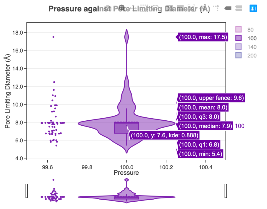
Using the range slider to interact with your plot
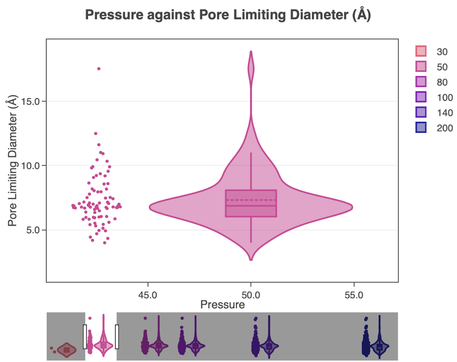
Single clicking on the desired legend box will remove the respective violin plot from the graph. A single click on the same X-axis grouping in the legend will add the violin plot back into the graph. Using the range slider (tool directly below the x-axis) can also isolate one or multiple violin plots. Dragging the left and right toggle will produce the same reflection that is on the range slider.
Distrbution Plot
As mentioned in MOF Explorer Animations, with all animations, auto range in frames is currently not supported in Plotly. Therefore, the user must slide the maximum animation frame and press the auto-scale button on the toolbar at the top right side of the plot. The user can then press play and the range will auto-scale automatically.
The user must populate ALL the dropdowns and radio items to produce a graph. If the dataset uploaded does not provide the structures of families ‘None’ grouping will apply. The rugged plot above the histogram indicates the distribution of structures against the X variable selected. The histogram represents the X variable selected against the number of structures that apply.
Contributing
For changes, please open an issue first to discuss what you would like to change. You can also contact the AAML research group to discuss further contributions and collaborations.
Contact Us
![]()
Email:
Mythili Sutharson,
Nakul Rampal,
Rocio Bueno Perez,
David Fairen Jimenez
Website: http://aam.ceb.cam.ac.uk/
Address:
Cambridge University,
Philippa Fawcett Dr,
Cambridge
CB3 0AS
License
This project is licensed under the MIT License - see the LICENSE.md file for details
Acknowledgments
- AAML Research Group for developing this dashboard for the MOF community. Click here to read more about our work
- Dash - the python framework used to build this web application