Welcome
- To deploy the app on command line, to create a URL using Heroku or to access our GitHub repository click here.
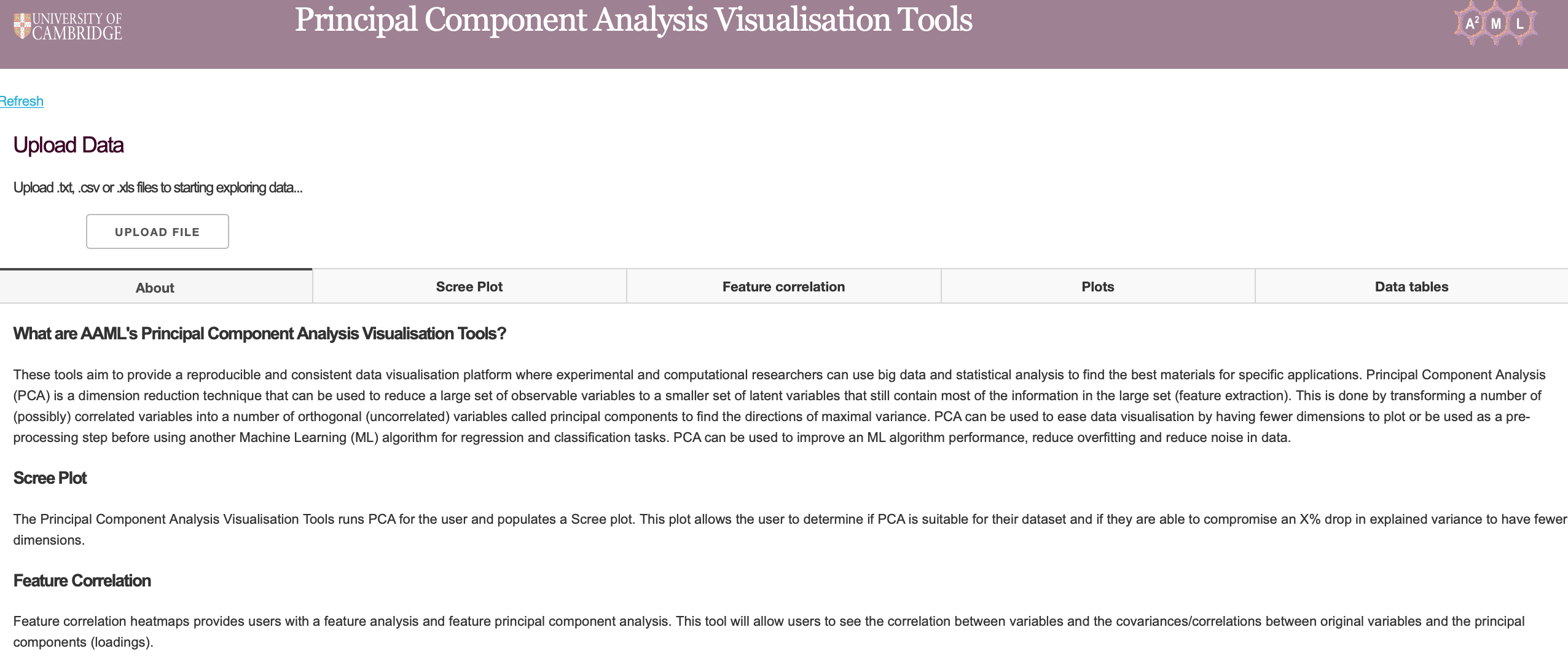
About
These tools aim to provide a reproducible and consistent data visualisation platform where experimental and computational researchers can use big data and statistical analysis to explore their data or the adsorption related data we provide to find the best materials for specific applications.
Principal Component Analysis (PCA) is a dimension reduction technique that can be used to reduce a large set of observable variables to a smaller set of latent variables that still contain most of the information in the large set (feature extraction). This is done by transforming a number of (possibly) correlated variables into a number of orthogonal (uncorrelated) variables called principal components to find the directions of maximal variance. PCA can be used to ease data visualisation by having fewer dimensions to plot or be used as a pre-processing step before using another ML algorithm for regression and classification tasks. PCA can be used to improve an ML algorithm performance, reduce overfitting and reduce noise.
The Principal Component Analysis Visualisation Tools runs PCA for the user and populates a Scree plot and feature correlation heatmaps to allow the user to determine if PCA is the right dimensionality reduction technqiue for the user. Hereafter, the user can drop variables they would not like as features and produce biplots, cos2 plots and contribution plots for the user to analyse principal components computed from the analysis. All the information from the PCA is retained and the user can download this data from the data tables provided.
Data File Requirements
The data file to upload must meet the following requirements:
1. A .xlsx, .csv or a .txt data file must be uploaded. Please note that large .xlsx files take time to process so .csv or .txt files are preferred. For .txt files the application only accepts comma text separators.
2. The uploaded datasheet must have the structure name or identifier on its first column (shown in table 1).
3. The uploaded datasheet must be completely populated (no blank cells). Blank cells can be replaced to ‘0’ using the ‘Replace All’ function in Excel
4. The data must be tidy data. Each variable must occupy a single column and each observation a row. Example data files AAML_Oxygen_Raw_Data.csv and AAML_Oxygen_Data.csv are both examples of tiday data and can be found here
Table 1: Example File Upload
| DDEC code | Family | Pressure | Grav. Uptake (mol/kg) | Vol. Uptake (cm3/cm3) | Qst (kJ/mol) | … |
|---|---|---|---|---|---|---|
| AFIXAO | ZIF | 1 | 0.3379 | 8.4985 | 15.6505 | … |
| ABUWOJ | ZnO | 1 | 0.5687 | 14.7654 | 16.5644 | … |
| AVAQIX | None | 1 | 0.8956 | 26.2387 | 18.2041 | … |
| HOWPUF | None | 1 | 0.3486 | 7.5929 | 19.7446 | … |
| HOWQAM | None | 5 | 0.5020 | 11.4214 | 15.7436 | … |
| HOWQEQ | None | 5 | 0 | 17.5332 | 16.8026 | … |
| HOXKUB | None | 5 | 0.4167 | 16.0261 | 20.7236 | … |
| … | … | … | … | … | … | … |
The tab of the app will fade when the app is computing a user input. It will return to its original color once it has completed the user's input (Figure 2). In addition to the faded tab, the dashboard browser tab will show “Updating…” when the tool is updating the data. Wait for this to return to ‘Dash’ before using the tool. This is when the file upload is complete.
Functions found on PCA Plots
Download plots
As shown in the picture, click on the camera icon and get the plot in PNG format.
![]()
Zoom modes
If the plots mode is set to ‘Zoom’, click and drag on the plot to zoom-in and double click to zoom-out completely (auto scale of both axis). The user can also zoom in and out by clicking on the + and – buttons. Axes labels will automatically optimize as you zoom in.
![]()
Pan mode
If the plot’s drag mode is set to ‘Pan’, click and drag on the plot to pan and double-click to reset the pan.
![]()
Reset axes
One can also drag the x and y axis in a horizontal and vertical motion respectively to move along the length of the axis (Figure 3). Clicking ‘Reset axes’ will reset the axes.
Toggle Spike Lines
This button will provide an x and y axis spike line.

Hover options
One of these two buttons is selected at all times. Clicking ‘Show closest data on hover’ will display the data for just one point under the cursor. Clicking ‘Compare data on hover’ will show you the data for all points with the same x-value.

Remove outliers and deciding between using a correlation or covariance matrix
On all plots and downloadable data tables, users can determine if they would like to remove any outliers present in their data. Any variable that contains values above and below 3 standard deviations from the mean are removed.
The user can also determine if they would like the tool to use a covariance or correlation matrix. When the data is standardised (scaled) by removing the mean and scaling to unit variance, the covariance matrix becomes the correlation matrix. When the variables are of similar scales a covariance matrix is more appropriate. A correlation matrix is used when the variables in the data set have varying scales (order of magnitudes). Using data with different orders of magnitude will result in the variables with the highest variance dominating the first principal component (the variance maximising property). Standardising data will ensure all variables have equal variance. It must be noted that standardising your data set assumes that your data follow a normal distribution. Use the covariance matrix when the variance of your variables are important.
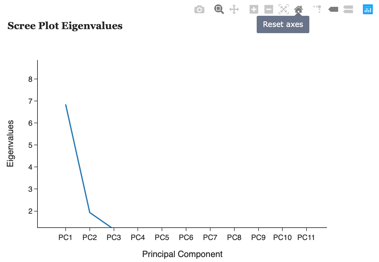
Scree Plots
This tab helps the user decide how many principal components to keep. The following criterion can help determine this:
1) A scree plot plots eigenvalues according to their size against principal components to see if there is a point in the graph (often called the elbow) where the gradient of the graph goes from steep to flat. As a rule of thumb, retain principal components that only appear before the elbow.
2) Retain the first k components which explain a large proportion of the total variation, usually 70-80%.
3) The Kaiser criterion can also help decide how many principal components to keep. The Kaiser rule is to drop all components with eigenvalues less than 1.0 – this being the eigenvalue equal to the information accounted for by an average single item.
3) Consider whether the component has a sensible and useful interpretation. Is the variation explained in the data an adequate amount?
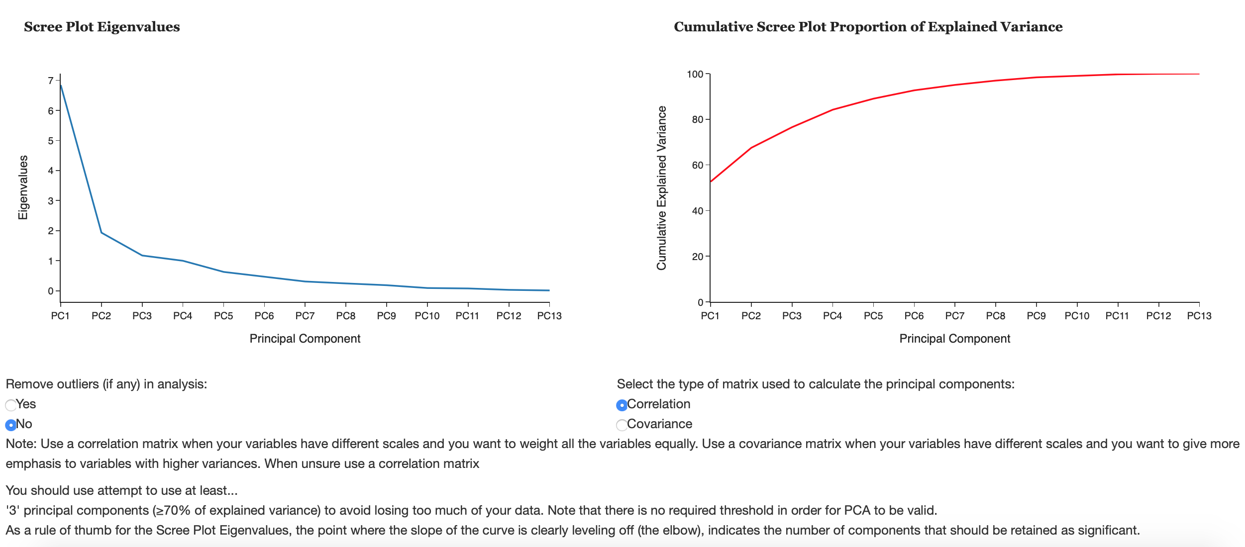
Scree Plot Eigenvalues
A scree plot plots eigenvalues according to their size against principal components to see if there is a point in the graph (often called the elbow) where the gradient of the graph goes from steep to flat. As a rule of thumb, principal components that only appear before the elbow.
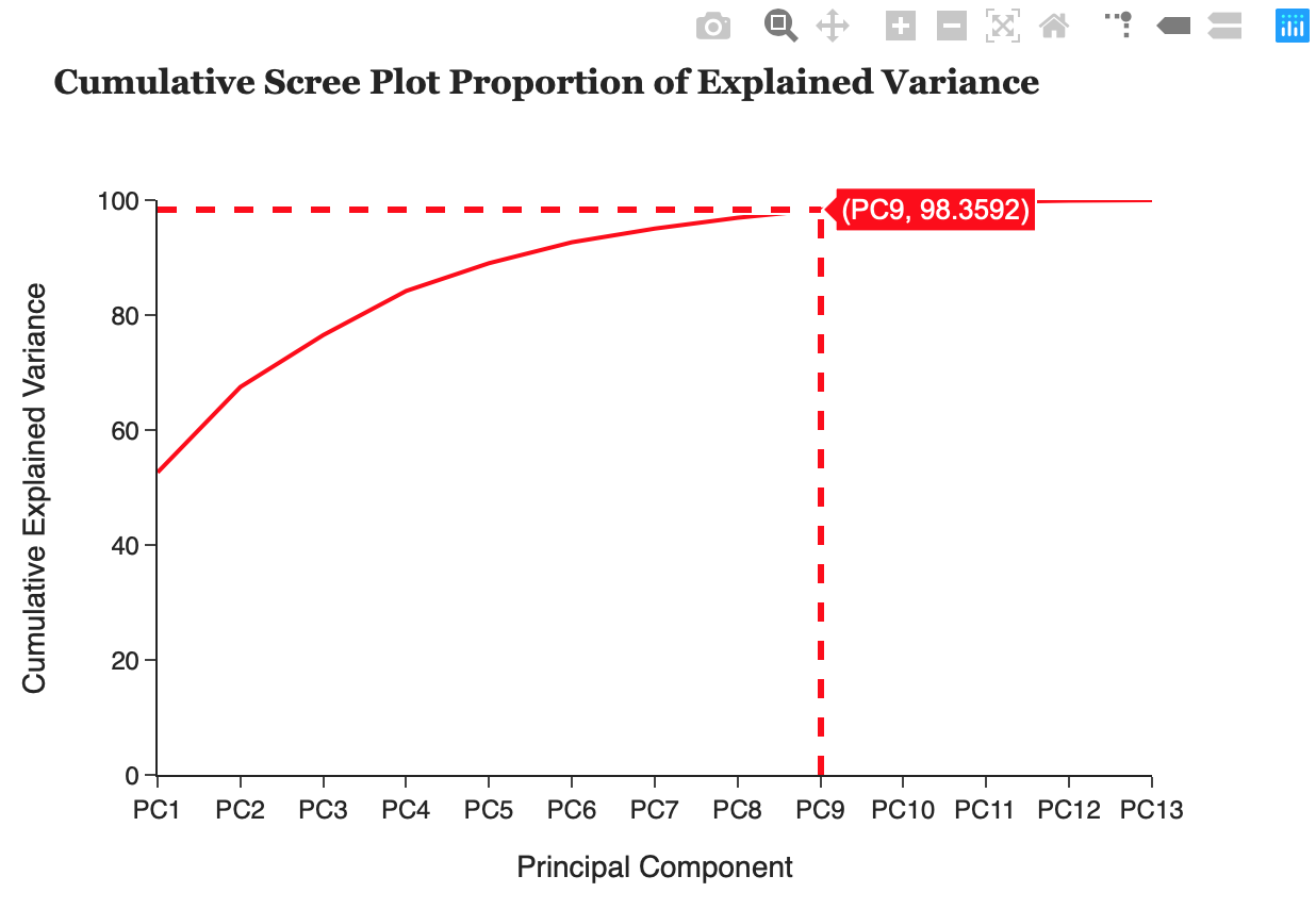
Cumulative Scree Plot Proportion of Explained Variance
The proportion of explained variance by a principal component is the ratio between the variance of that principal component and the total variance expressed as a percentage. i.e. An explained variance of 42% suggests that the respective principal component will explain 42% of the total variance in the data set. This plot can allow the user to see what % of their data they will lose by reducing the variables used to k principal components and determine if PCA is a suitable technique to use on their data.
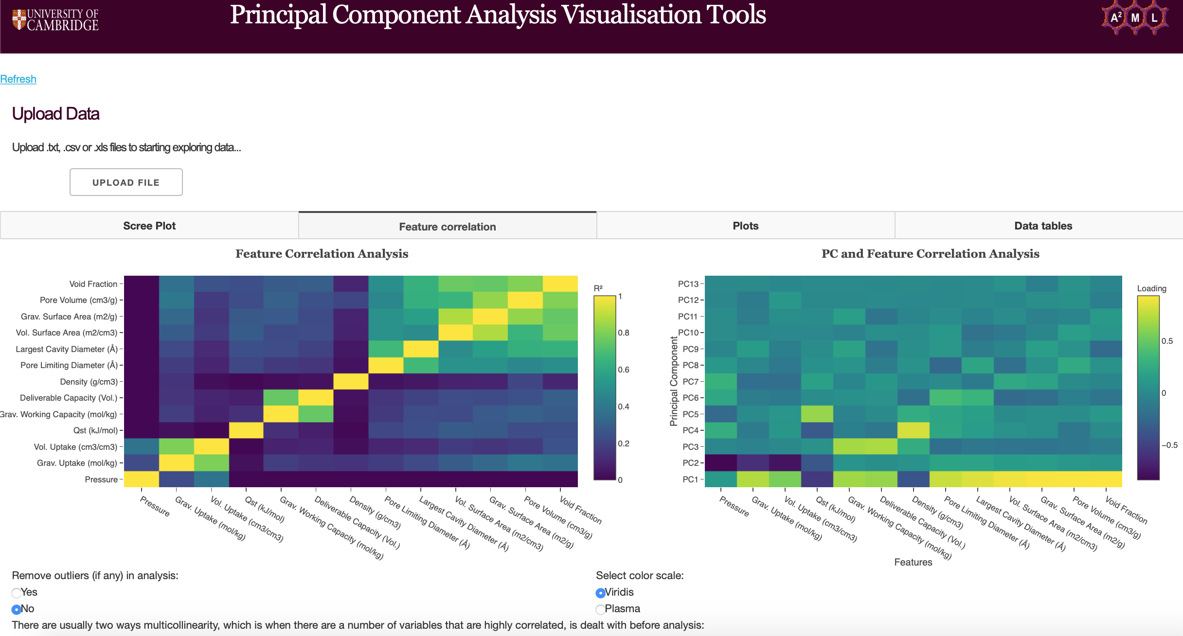
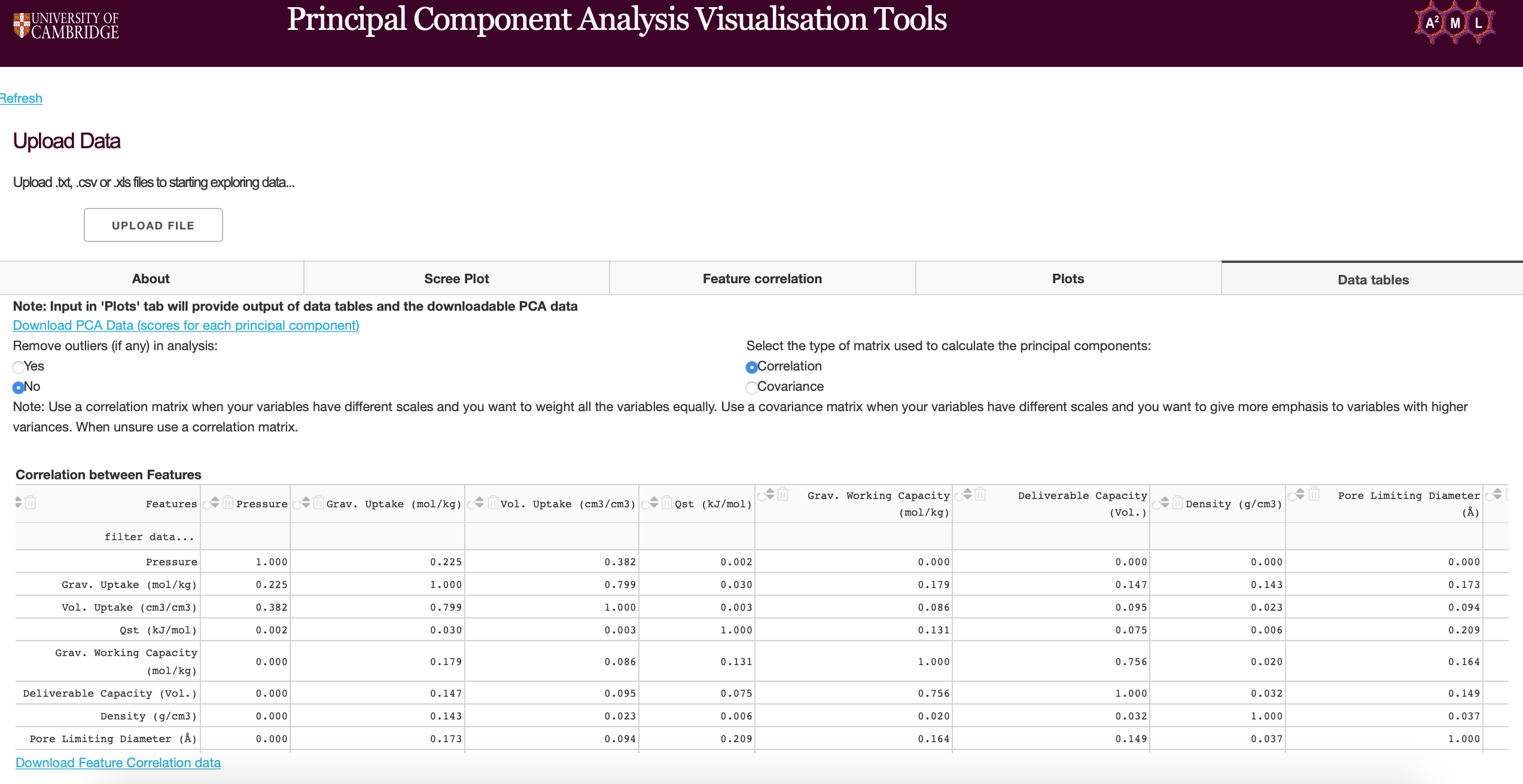
Feature Correlation
The feature correlation heatmaps can be used to determine the correlation between features and principal components. Users can remove outliers from uploaded data, choose the matrix type for PCA (see functions found on PCA plots) and choose color scales for the heatmap (Viridis and Plasma).
Feature Correlation Analysis
The feature correlation heatmap plots the coefficient of determination (R-squared) of features. The correlation coefficient (R) measures the linear relationship between two variables, while the coefficient of determination measures explained variation. Highly correlated variables can be dealt with by using PCA to obtain a set of orthogonal variables or removed before further analysis if PCA is a not suitable technique.
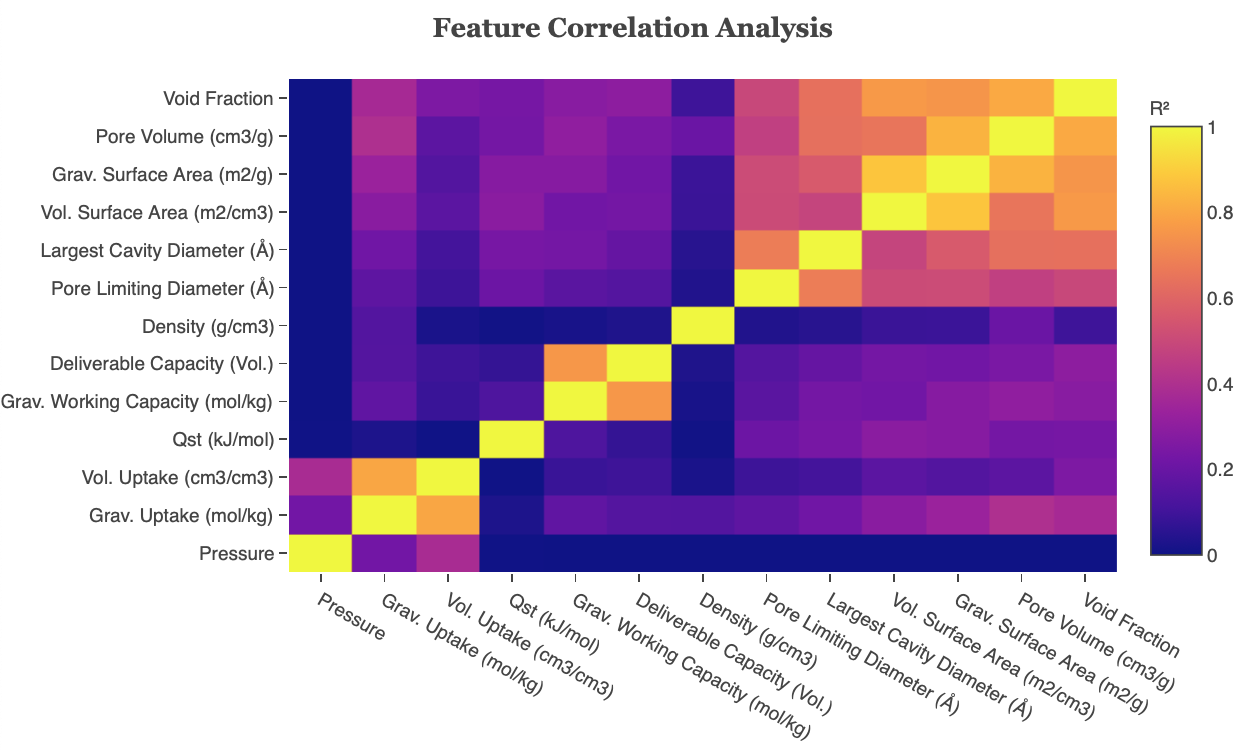
Figure 10: Feature Correlation heatmap
Principal Component and Feature Correlation Analysis
Principal Component and Feature Correlation Analysis plots the loadings of each principal component. Note that PCA has been run here. Loadings are the covariances/correlations between the original variables and the principal components. Mathematically speaking, loadings are equal to the coordinates of the variables divided by the square root of the eigenvalue associated with the component.
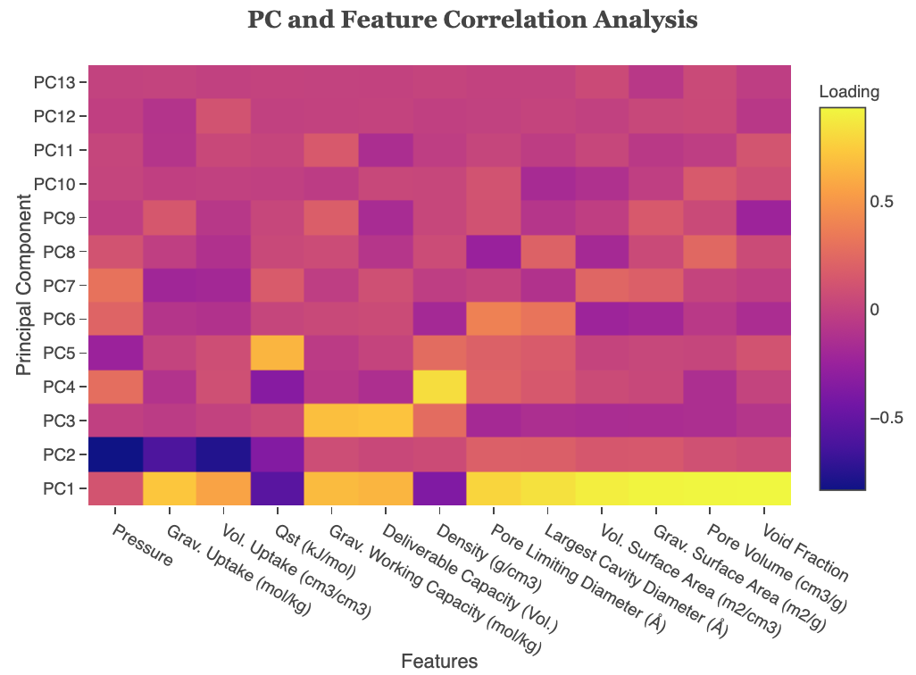
Figure 11: PC and Feature Correlation Analysis
Plots
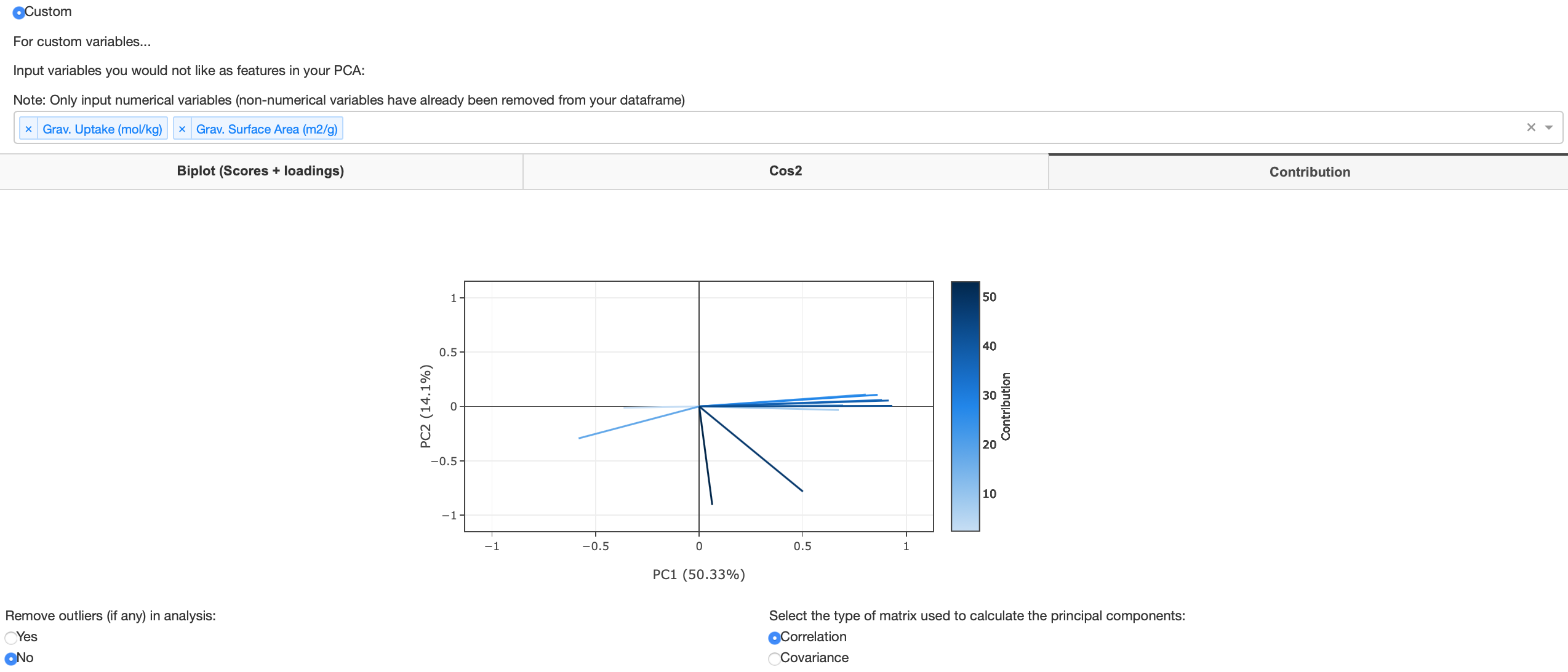
This tab contains the main PCA tool plotting capabilities. Users can select if they would like to use all variables in the uploaded data set as features or drop certain variables. The user can plot a loading plot, a biplot (scores + loadings), a cos2 plot and a contribution plot. The biplot can take up to 4 dimensions as users can include size and color variables of any features that were dropped before running the PCA tool.
Biplot
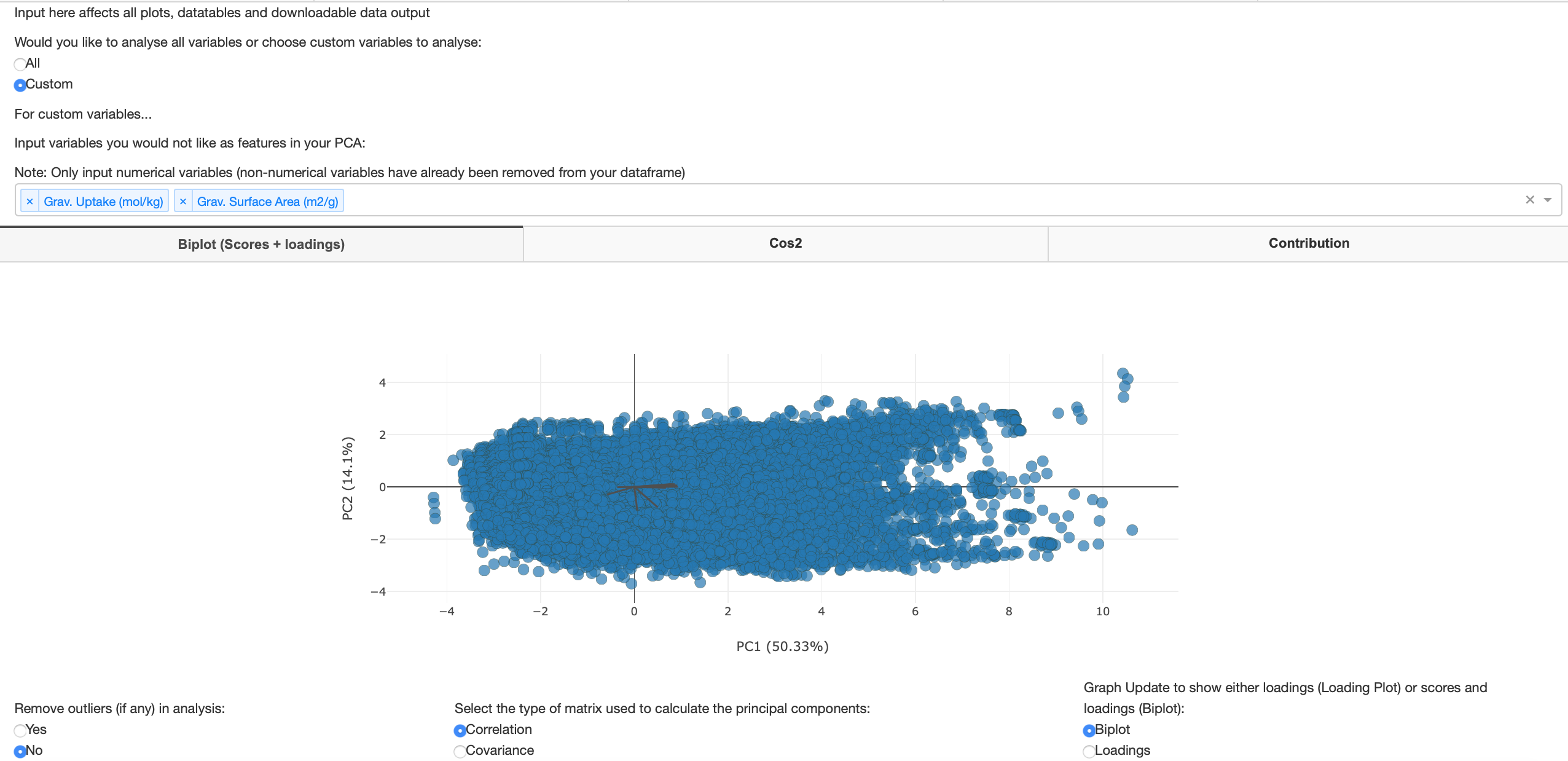
A biplot contains both scores and loadings from PCA. Biplots are a graphical method for displaying both the variables and sample units described by a multivariate data matrix. Scores are linear combinations of the data that are determined by the coefficients for each principal component. A score plot plots the scores of the first principal component (x-axis) against the second (y-axis). The loading plot shows how strongly each feature influences a principal component. A loading plot is the loadings of the first and second principal components expressed as vectors. The figure below shows when the user has decided to use all variables as features in their PCA.
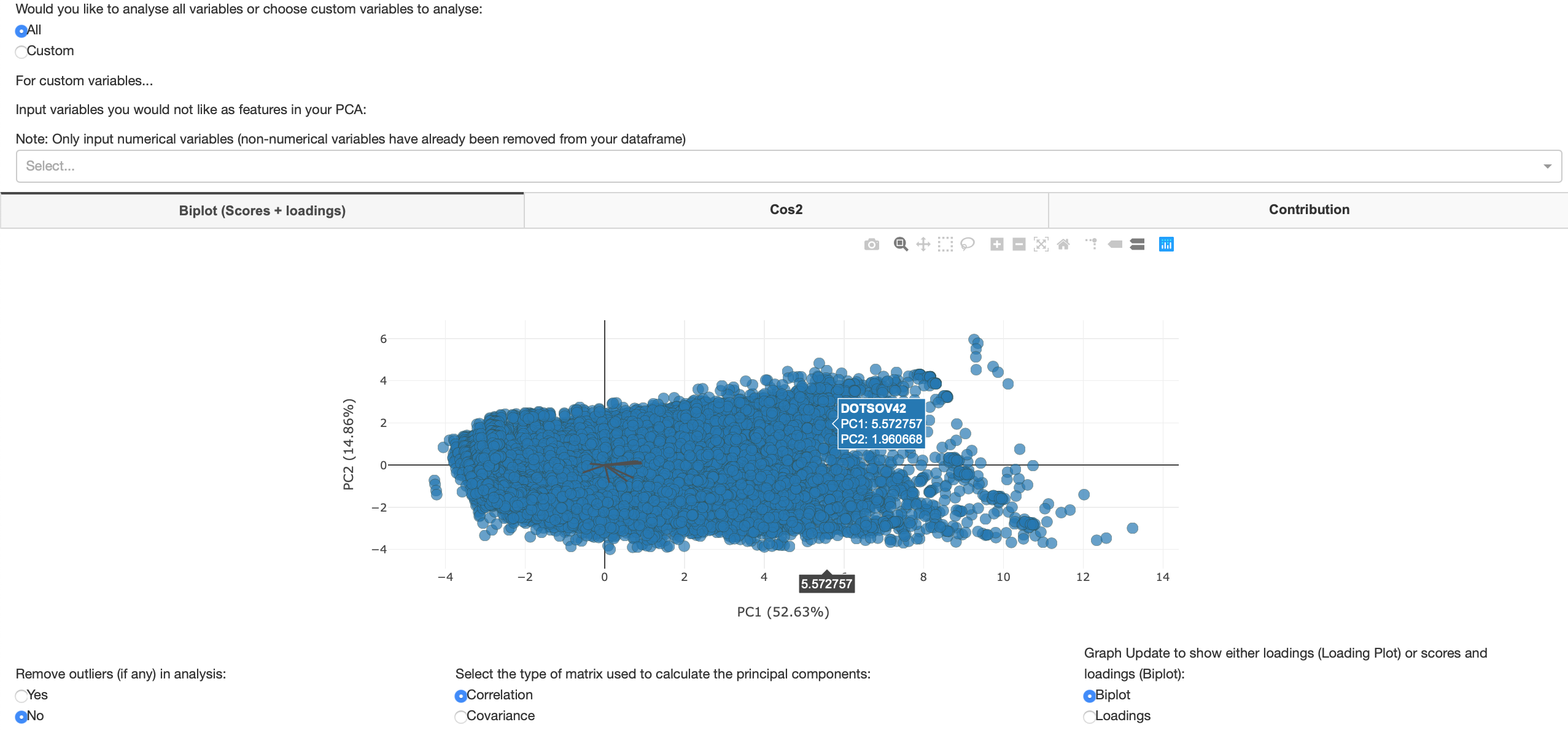
Figure 12: All variables Biplot
A loading plot shows how strongly each feature influences a principal component. The angles between each vector also show how correlated they are with one another. When two vectors are close, forming a small angle, the two variables they represent are positively correlated. If the two vectors meet each other at 90°, they are likely to be uncorrelated. When they diverge and form a large angle (close to 180°), they are negatively correlated.
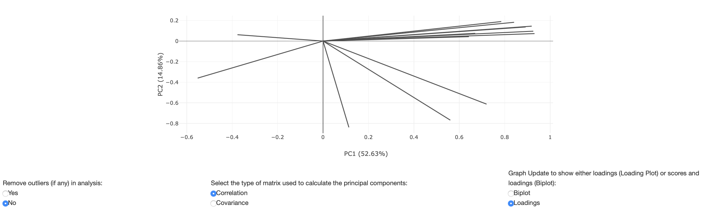
Figure 13: Loadings plot
The figure below shows when the user has decided to use custom variables to decide what variables to use as features in their PCA. A user may decide to drop dependent variables that would be used as target variables (variables one would like to predict) in further machine learning algorithms. Note that PCA is an unsupervised machine learning technique so the model learns without any target variables. In order to populate the biplot, after pressing the custom radio button the user must* select which variables they would like to drop in their analysis. If you have a large dataset, this may take a few seconds to compute - the faded headings tab will return to normal once fully computed.
As previously mentioned, the user can view the biplot in 3 and 4 dimensions by selecting color and size variables to plot. Any dropped variables will be populated in the color and size variable dropdown as shown in figure 15. Figure 16 shows a biplot where a color and size variable has been selected.
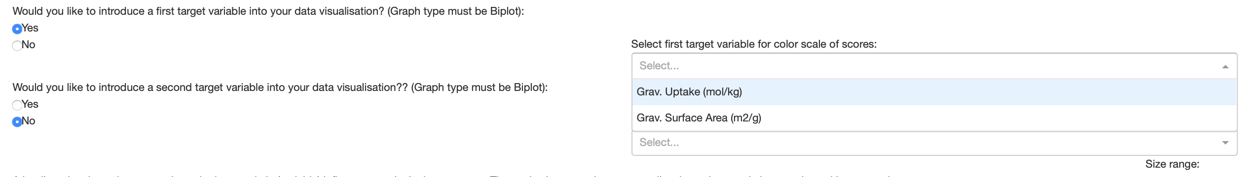
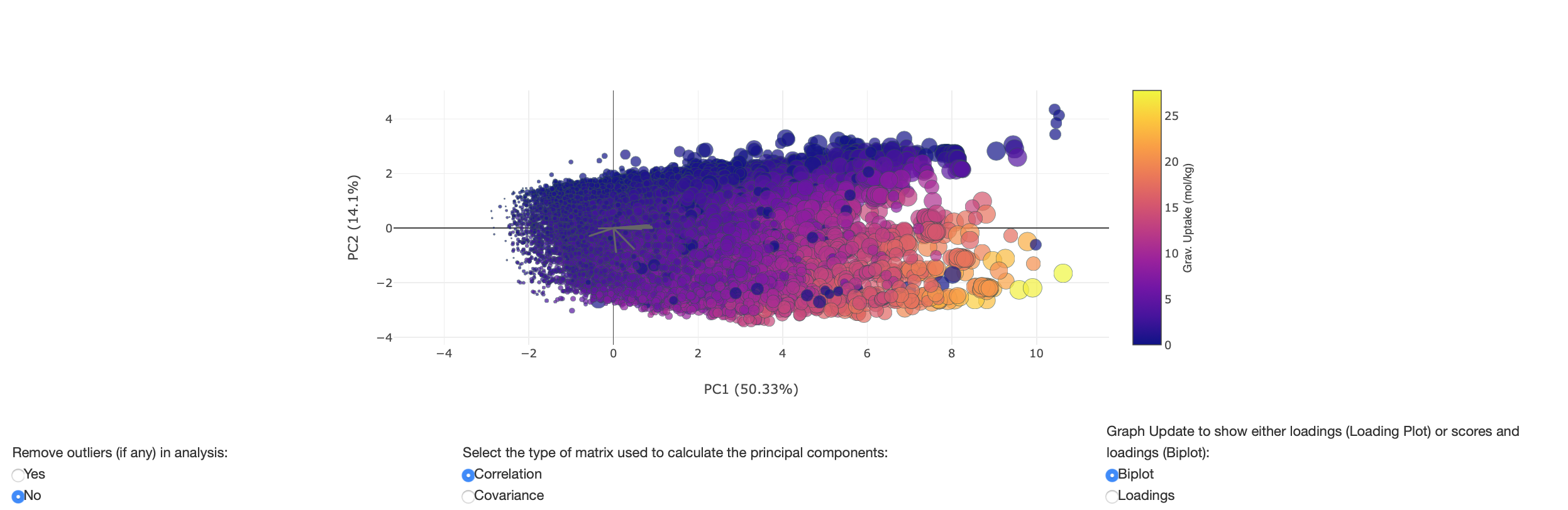
Figure 16: Biplot with color and size variables
Cos2 plot
The squared cosine (cos2) shows the importance of a component for a given observation i.e. measures how much a variable is represented in a component. Components with a large squared cosine contribute a relatively large portion to the total distance of a given observation to the origin and therefore these components are important for that observation. The eigenvalue associated to a component is equal to the sum of the squared cosines for this component.
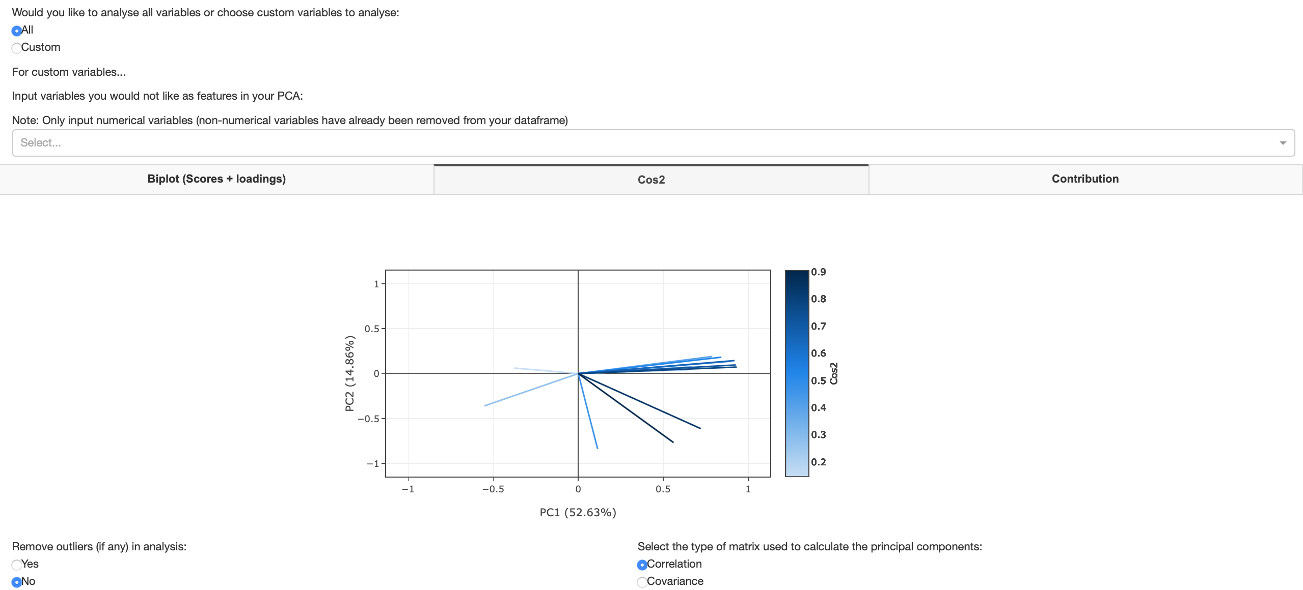
Figure 17: Cos2 plot
Contribution plot
A contribution plot contains the contributions (in percentage) of the variables to the principal components. The contribution of a variable to a given principal component is the cos2 of a said variable divided by the total cos2 of the principal component.
Downloadable data tables
This tab provides table overviews of the users PCA Analysis. Results correspond to the variables chosen as features in the 'Plots tab'. The user can decide to remove or keep outliers or use a covariance or correlation matrix in every tab. These inputs are also available in the 'Data table' tab and will populate the data tables accordingly. Users can download the tables as shown in this tab. Downloadable tables include PCA scores, feature correlation analysis, eigenvalue analysis, loadings, squared cosines and contributions from PCA. Any change in input of the variables used as features in the 'Plot' tab, removing outliers in the 'Data tables tab' and choosing between a covariance and correlation matrix in the 'Data tables tab' will automatically update the data table and also the downloadable data. All downloadable files will be saved in the 'Downloads' folder of your laptop in .csv format.
Methods and Formulas for Principal Component Analysis
To read more about the mathematics behind PCA, Abdi et al. have published a comprehensive overview of this technique. Click here to view and download.
Contributing
For changes, please open an issue first to discuss what you would like to change. You can also contact the AAML research group to discuss further contributions and collaborations.
Contact Us
![]()
Email:
Mythili Sutharson,
Nakul Rampal,
Rocio Bueno Perez,
David Fairen Jimenez
Website: http://aam.ceb.cam.ac.uk/
Address:
Cambridge University,
Philippa Fawcett Dr,
Cambridge
CB3 0AS
License
This project is licensed under the MIT License - see the LICENSE.md file for details
Acknowledgments
- AAML Research Group for developing this dashboard for the MOF community. Click here to read more about our work
- Dash - the python framework used to build this web application
- Scikit-learn - machine learning library in Python